Who says only light colors can be used in small Spaces? Choose the right material and design, and dark walls can become a magic tool for expansion!
1.Breaking Prejudice: The “Counter-intuitive Truth” of Dark Walls and Small-Sized Apartments
Misconception Exposure:
“Light colors make one look bigger?” Wrong! Blindly painting the entire house white can actually make the space flat and lack a sense of layering!
Scientific endorsement
Quote design theory:
“Dark walls can increase the depth of the space through the visual Receding Color effect” – “Color Psychology in Interior Design”.
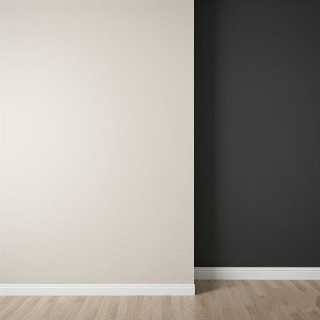
Comparison case diagram:
In the same small-sized room, light-colored walls versus dark background walls (mark the difference in visual focus).
2.4 “Secrets to Looking Larger” with Dark Panels in Small-Sized Apartments
① Local finishing touch method: Control the proportion of dark colors
The Golden Rule:
One wall (such as the TV background wall or the headboard) should be in a dark color, while the other walls should be kept in light or neutral colors.
Data validation
When the proportion of dark colors is less than 30%, the spatial visual area expands by 15% (compared with the virtual experimental model).
② Material reflection enhancement: Balance the dark tones with glossiness
Recommended material:
Brushed metal panel: Reflects natural light and reduces a sense of oppression (such as deep gray-blue + champagne gold lines).
Matte frosted panel: Absorbs light to create a sense of texture and avoids excessive reflection (suitable for low-floor units with poor lighting).
Lightning protection list:
Avoid using high-reflective mirror surface materials throughout the house (which can easily make it look messy).
③ Longitudinal extension technique: Stretching the height of the space
Design skills:
Dark panels extend from the floor to the ceiling (paired with curtains of the same color series), enhancing the vertical lines.
Case picture: The 3-meter-high apartment uses deep olive green walls and embedded light strips, visually raising the height by 30cm.
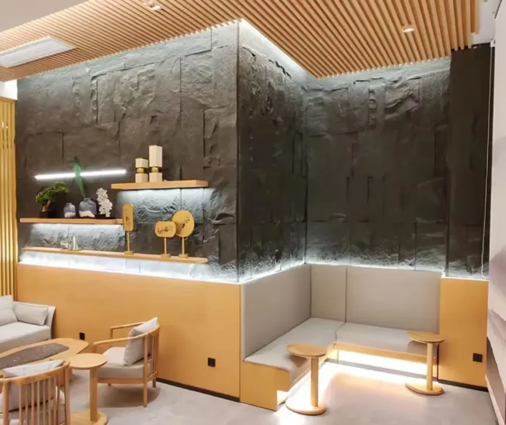
④ Open layout: Dark-colored areas define functional zones
Scene application:
Dark panels are used as “soft partitions” (such as the boundary wall between the dining room and the living room) to avoid the sense of obstruction caused by solid walls.
3.5 High-end Color Matching Formulas (with Color Numbers + Material Recommendations)
Style: Modern light luxury
Color scheme: Deep sea blue + antique copper metal lines
Material combination: Matte metal composite panel
Suitable space: living room background wall
Style: Retro and modern
Color scheme: Dark green + amber glass panel
Material combination: 3D embossed PVC board + glass inlay
Suitable Spaces: entrance hall, study
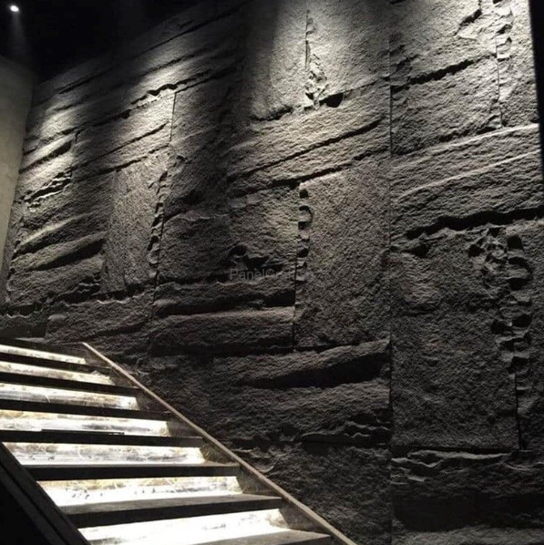
Style: Wabi-sabi
Color scheme: Dark stucco texture + natural wood color furniture
Material combination: Micro-cement texture panel
Suitable Spaces: bedroom, tea room
Style: Minimalist dark
Color scheme: Carbon black + hidden linear light strip
Material combination: Ultra-thin matte aluminum plate
Suitable Spaces: Studio, audio-visual room
Style: Warm and healing
Color scheme: Dark coffee color + off-white woven texture
Material combination: Fiberboard with a texture similar to linen
Suitable Spaces: children’s room, balcony
4.A Guide to Avoiding Pitfalls: 3 Taboos for Dark Walls in Small-Sized Apartments
Taboo One: Dark colors throughout the house without any layers
Negative example picture: Dark grey walls + black furniture, the space is oppressive like a “cave”.
Correction plan: Dark walls paired with light floors and white ceilings, or a design with partial blank space.
Taboo Two: Neglecting lighting design
Incorrect demonstration: Single main light illumination, dark areas are dim.
Solution:
Combined lighting: Track spotlights (accent lighting) + light strips (ambient lighting) + floor lamps (supplementary lighting).
Color temperature recommendation: 3000K-4000K warm white light. Avoid cold white light that intensifies the coldness.
Taboo Three: Mixing and matching random colors
Safety rule: When dark walls are the main color, furniture and soft furnishings should be in the same color family or neutral colors (beige, gray, white).
Still don’t know what to use for decoration and are still struggling with which home’s quality is more guaranteed. Come and click on our homepage to learn more!